Visual Rhetoric in Menu Design: How to Make Your Restaurant Menu More Appealing
One way you can immediately elevate the dining experience is through the aesthetics of your menu design.
Your menu communicates a lot more than just the available dishes; the menu is what makes the food marketable to the consumers. It is often their first impression of the food and your restaurant branding, and acts as a guide that navigates customers through their meals in the most efficient way.
The customers are putting a lot of trust in you, so let’s make sure everyone knows they’re making the best decision for their personal palette!
Visual Rhetoric is how one appeals to their audience through visual elements like colors, images, and other various design principles.
These are the “rules” artists loosely follow when organizing their pieces. Applying these principles to your restaurant menu design is what makes the content digestible for the customer. The visuals also set the vibe of your establishment, and communicate to the customer what exactly they should expect for their dining experience.
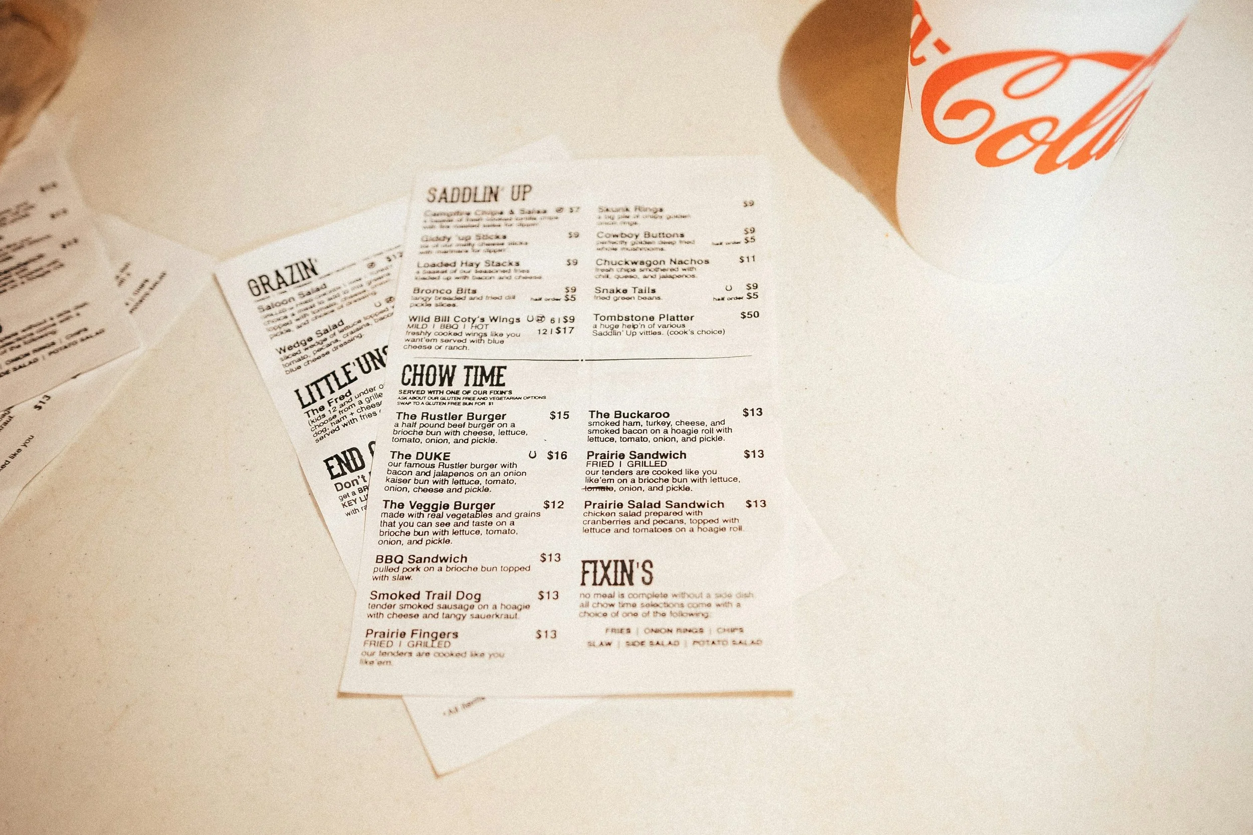
The first thing to consider is what kind of menu works best for your food business model. Do you need a binder to fit all of your options? Do the selections change every day? Do you want a virtual menu so customers can access it from anywhere? Maybe you want paper menus so kids can color while waiting (or adults, we’re not judging). You might even need a separate drink menu. Choosing the right menu layout helps improve the customer ordering experience.
For Addis, an Ethiopian restaurant, our redesigned menu layout introduced clearer visual hierarchy and more thoughtful categorization, making the menu easier to navigate for both regulars and first-time guests. We also added vivid, inviting menu descriptions and a dedicated section to help newcomers discover and understand the richness of Ethiopian cuisine. As owner Fekad shared, “Because of the menu change, the sambusa, meat and veggie combo, and the doro wot got more clear, and more orders are coming from that area. Our sambusa sales are up.”
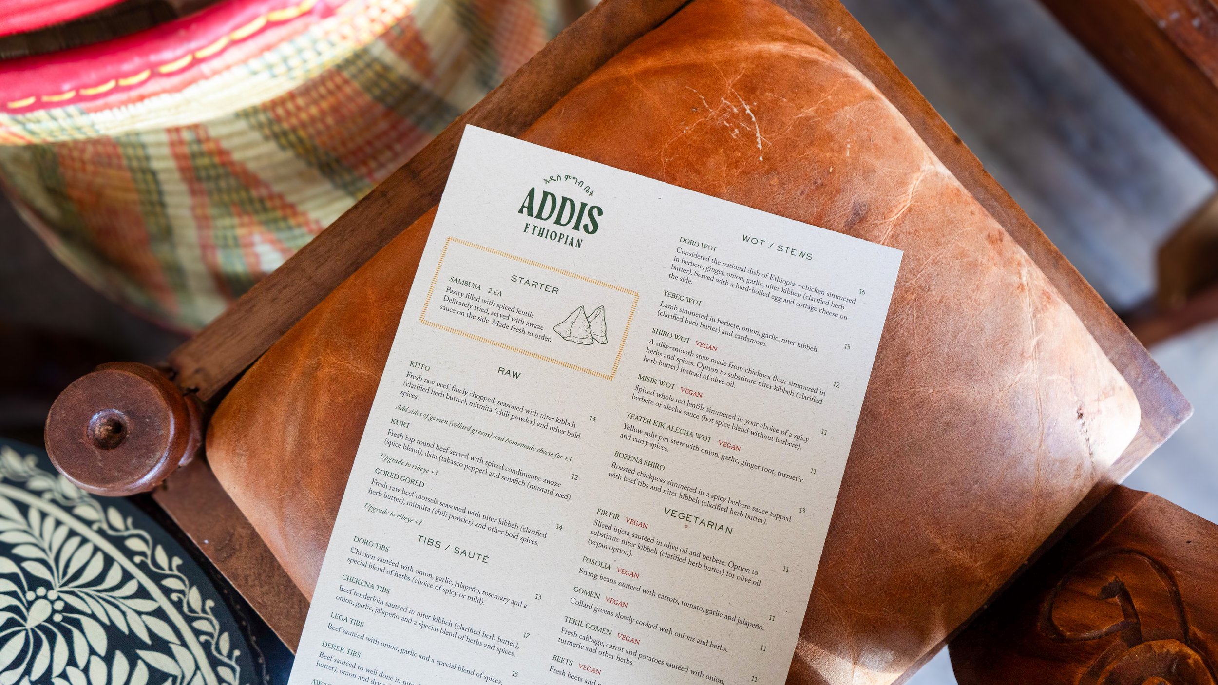
Menu redesigned by Akitso, Addis Ethiopian Restaurant, San Diego, CA
Imagery
To photograph or not to photograph — that is the question in visual menu design. Sometimes this can have a positive effect on your menu, as first impressions have a lot of influence. Images are a good tool for engaging the customer and building trust, helping customers feel like they know exactly what they’re getting and leaving less room for imagination. Photos should be high quality, authentic, and appetizing. Lighting, angles, and setting are key factors in effective restaurant menu design.
You don’t necessarily have to add pictures, however. Sometimes photos can actually hinder your menu design: clunky proportions, low-quality images, and imbalance can make the menu hard to look at and leave the customer feeling rushed or stressed when it comes time to order.
Minimalist menus are just as effective and can communicate the same messages through typography, spacing, and menu hierarchy.
Color
There is a lot of menu psychology behind colors and what they communicate in restaurant branding.
For example, red is known to promote hunger and excitement. That is why we often see fast-food restaurants with red themes (McDonald’s, Coca-Cola, KFC).
Green is associated with clean eating, the environment, and freshness.
Yellow is often linked to optimism, enthusiasm, and youthfulness. Think of family-style restaurants like CPK or Denny’s.

Dinner Menu, Royal Mandarin, National City, CA
Design Principles to Consider For Menus
Hierarchy
Hierarchy creates structure, organization, and direction in menu design.
This is what helps the customer decipher each category of the menu. Whether that’s breakfast, lunch, and dinner, or appetizers vs. entrées vs. desserts, hierarchy creates sections that help customers focus on exactly what they’re looking for and improves the customer ordering experience.
Repetition
Using the same font, structure, and repeated design patterns is important for keeping the customer engaged. Repetition also creates association and helps build a consistent restaurant brand identity.
Creating a key with icons can also be helpful for customers with specific food restrictions.
Negative space
It is important that your menu layout doesn’t overwhelm the customer. That’s why paying attention to negative space (or white space) is so important. Gaps and spacing between sections help create grouping and make menus easier to read.
Balance
Balance is an important principle that combats overcrowding and overwhelm in restaurant menu design. Whether you use symmetry or asymmetry, following a central visual line helps the flow of the menu feel smooth and seamless.
Proportion
Proportion is important to consider, especially if you choose to use images. It refers to the weight and space that each element takes up. While proportion is often created naturally by other design elements working together, it’s still important to pay attention to alignment and symmetry between text, images, and prices.
Contrast and Emphasis
This is the “pop” of color people often refer to in art and menu design. Contrast helps draw attention to important details — maybe a featured dish, substitutions, or prices for menu items you want to highlight.
Unity
Often created through the other design principles, unity is what makes a menu feel cohesive, intentional, and finished. Strong unity ties together your menu aesthetics, branding, and overall dining experience.

Menu, Cesarina, San Diego, CA